Countdown timers show how much time is left until an event or deadline.
They start at a certain time and count down to zero, which makes you feel rushed or excited.
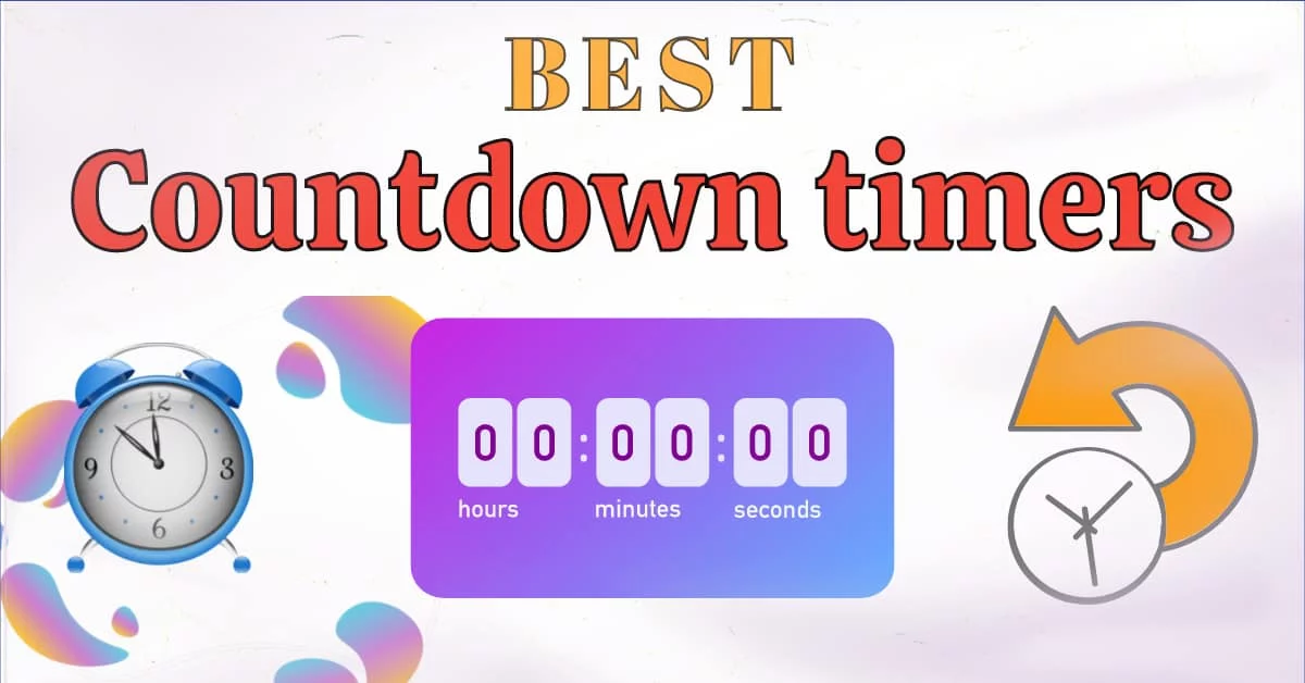
Websites commonly have these timers for sales, upcoming events, or new product launches. They can be digital clocks that show the hours, minutes, and seconds, or they can be pictures, such as progress bars.
Countdown timers have three main purposes:
- help keep visitors interested
- get them to act quickly
- clarify when events are happening
These are pretty common in email marketing as well. And they’re popular for increasing sales and conversions in general. But there’s a catch. These countdown timers have to be attractive enough to catch the eye of a consumer.
How’s that done?
We explain.
Colors
Using color well can draw attention to something and make you feel a certain way. When designing countdown timers, it can be especially helpful to choose colors that go with your brand and make people feel excited or rushed.
Warm colors can make you feel more passionate and rushed than cooler tones. Because of these qualities, they make great choices for countdown timers because they can give the impression of action and immediacy.
But it’s important to think about how well the colors go together to make sure the timer stays readable and looks good.
Font
Your countdown timer will work much better or worse depending on the font you choose. When you choose clean, easy-to-read fonts, the timer is easy to understand at a peek.
Avoid typefaces that are too complicated or decorative; they can be distracting and make it harder to read. Fonts that are simple help make the information about the countdown stand out.
You can also make the timer stand out from other things on the page by using different colors or font weights. This difference helps to get people’s attention and shows how important or urgent the countdown is.
Motion
A countdown timer with subtle animations or movements can look better and get people’s attention.
As the countdown gets closer to zero, you might want to add effects like blinking or pulsing to make the time seem more important. A dynamic countdown animation can also show how much time has passed, which makes the timer more interesting.
But be careful not to use too many animations because too much movement can be annoying or cross a line for viewers.
Design
As interesting as it is to look at them by themselves – countdown timers should also fit in with the rest of the design you have in mind.
Make sure that the style, color scheme, and fonts of the timer go with the look of your website or marketing campaign.
With this unified approach, your audience will have a more polished and professional experience.
Placement
Put the countdown timer somewhere clearly noticeable, like next to the call-to-action (CTA) button or in the hero section of your website or landing page.
Placed carefully, like on product pages or in email campaigns, countdown timers can heighten the sense of scarcity and urgency, which can make people act and make decisions more quickly.
Apart from the above, you’ve to be careful about the following 5 best practices for your countdown timers and – by extension the campaign itself – to have a chance at success:
- Keep the time realistic.
- Keep the messaging clear.
- Be consistent on all platforms.
- Keep testing and optimizing.
- Be honest and transparent.
Marketers can use Sendtric to make custom countdown timers that make email campaigns feel more urgent and increase conversion rates. It works well with most email platforms and has an easy-to-use interface that makes managing campaigns quick and easy.
For more information, visit: http://sendtric.com/